Anyway, some book covers are a few of my favorite things.
I've opined before on this blog (IIRC, most recently in Best of Edward M. Lerner) that I don't have favorites among my own literary "children." After each book's many months -- sometimes, even, years -- of gestation, I've bonded with them all.
That said, the covers of my books aren't my children. I get to -- and I do -- have favorites. Which we'll come to. Soon.
Some covers are of the artistic school I'll call "SF Default": generic spacecraft juxtaposed against Earth or random space rock. There's nothing wrong with that. Such covers clearly identify space-based fiction, just as other generic covers (cowboy on horse; Six-Pack-Abs Guy shirtless for no obvious reason) signal other genres. But indicating an overall genre is pretty much all this sort of cover accomplishes.
My favorites are the covers that tantalize about the story(ies) to be found inside. That catch the eye. That signal the genre without being generic. I've been fortunate enough for my writing to have inspired some truly great covers. (Some of these books have been reissued; the Kindle links beneath the covers to follow in all cases point to the current editions.)
Without further ado, here are those artistic favorites. Each cover here is well worth clicking through for a larger image.
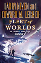
 |
| Original edition art |
.jpg) |
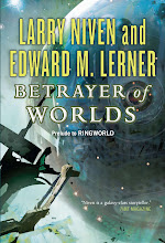
| Original edition art |
 |
| First edition art tweaked for paperback re-release |
 |
| Original edition art |
%20front%20cover.jpg) |
| Second edition art |
 |
| First edition art |


No comments:
Post a Comment